Thursday, November 19, 2009

Luminescence Expressive Drawing 11-20-09 -Environmental Design 101


...Some brainstorming ideas for my "Expressive" drawing of my Luminary, the next step. With certain guidlines to follow such as paper type/color, drawing utensils (3 colors only) and size...it was time to get creative with a composition that compliments my Luminary. I chose Indigo Blue Canson paper and purple, yellow and orange pastels that nicely resembles the light, shadow and shapes of my field of light and lighting structure itself.

Wednesday, November 18, 2009

Luminescence Final Model- Environmental Design 102


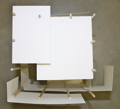
...This is my second and final "Luminescence" model. I made quite a few adjustments to my construction this time. I chose to Double the size of the lamp so the light bulb itself could sit high enough above the colored cut outs to give off a definite pattern of shapes on the surface it is hung. Also I lined the inside with black construction paper to block out the light, focusing almost all of it on the light source coming out of the bottom. I covered the seems where the plastic pieces attach to make it more unified.

Overall, I love what I did and I am very proud of the product I produced. This lamp isn't intended for a specific place in a house or hovering over a certain piece of furniture. But it is meant to be displayed so the field of light is at it's finest, whether that be sitting on something or being hung, the choice is yours. However, we were to include our Luminaere in our "Lake House" designs for our IAR 110 class. I chose the young boys room, hung over the dresser. The light affect and colors of the lamp went best with his bedroom and the essence it was already portraying. Fun and young but soffisticated enough for a 12 year old boy.

Tuesday, November 17, 2009

Luminescence-Continued


This is my first ideation of my Luminaire. I was inspired by kaleidescopes. It's built mainly of plastic parts i found in two bird feeders, binder dividers, and bristol board as the cover. As it was tested numerous times, we came to the conclusion that the "field" of light it gives off isn't quite strong enough so I'm currently putting the finishing touches on a new model. I love the light that shines through the plastic however that doesn't leave a strong enough stream of light for the reflection on the surface to be noticeable enough.

Thursday, November 5, 2009

Luminescence 11-6-09

Intense Lighting

Low Light

Color


Nightlight

Sunset


Uplight


Direction

Spotlight

Lamplight


Sunrise

Midday


"Design a luminaire using two materials that you used in previous projects, plus one new material of your choosing. Your luminaire should create a field of light that articulates the surface upon which it is cast. The light source is to be a compact fluorescent bulb(wattage of your choice) in a standard electric bulb socket."

I am finding this project difficult to be honest. The limits are endless and the guidelines are so vague that my mind goes everywhere when brainstorming for this particular project. Also I'm not familiar working with lights and electricity so this should be interesting! My main inspiration right now for "Luminescence" is a kaleidoscope. The multi-colored glass and the affect is has on whatever it is shining. We were asked to research different forms of lighting, natural and unnatural such as a sunrise, sunset, spotlight, nightlight, shadow, contrast, color, starlight etc. As I explored different photographs, some I have taken and others not...I have looked for a lot of different colors and glow in the field of light which I think resembles a kaleidoscope very well.

Thursday, October 29, 2009

Interior Perspectives 10-29-09


Next time I practice my perspective drawings I will pick spaces with more objects in them. They were hard to find and also be narrow enough to locate a vanishing point.

Wednesday, October 28, 2009

Dialog Critique and Comparison 10-30-09

Two dialog structures stood out to me. They do not carry the typical "square" structure that is common among a lot of us first years, but delicate, soft, caccoon like spaces. In Dajana's "Dialog" [her keywords being, "Fit Together" "Surround" and "Dialog", the folding of the cards are flowing and never ending in both her base and spaces. She had created one whole circular space that divides itself by a set of linear skewers. While the Carlie's project "Diamond Tree House", she has two separated circles that are unified through the similarity of the folding, angles, and proportion. Carlie's base adds a nice contrast in color and texture. Though I do not know her mind set behind it, it works in my mind. Both projects are easy on the eyes. To me, they seem dream like and wispy though the materials themselves are sharp and harsh. Instead of knowing and seeing what is in front of me, I see both Dialogs as representing many different things, creating many stories and ideas.

Morning Exercise 10-20-09

Morning Exercise 10-22-09

"Junk" Shadow Boxes in Perspective 10-22-09

Junk Drawer Drawing 10-20-09

Saturday, October 17, 2009

Dialog-10-28-09-Environmental Design 101


Using the same materials at the "Unity" project (12 rods and 12 planes) we were asked to "Create two distinct spaces that relate to one another in a mutually supportive way. In seeking this dialog, explore dualities of solid and void, front and back, in and out, orthogonal and diagonal, etc. Let the construction vocabulary reinforce and articulate your ideas about form."

This "Exploding Cube" is my first ideation. The idea is to give the illusion of a "perfect" cube in the center and an exploding cube formation surrounding and extruding from the center. The Skewers support the disappearing process of the cube "parts" and they in themselves create a successful space. I haven't decided what the base should be, any suggestions are much appreciated. It should deal with spaces in itself without breaking the rules and adding actual spaces. Only 2 are allowed.


My second ideation is photographed in the top 6 pictures. The changes I made are slight. I added a foam core base which i placed my "Dialog" project in the corner to add interest. I also changed the location and and joinery of a few of my extruding "cube" pieces. Above those pictures I have my orthographic drawings. A plan view, left elevation, front elevation and section elevation are included. I chose to draw them in pen to help them stand out against the black backround. I created dialog by using skewers to attach my separate drawings. I free handed the title which I wouldn't normally do but with it being titled "Essence and Accident" I thought it was appropriate.