Wednesday, February 24, 2010

Serial Envisioning-Design Visualization-- 2-25-10


Artist: Katherine Tyrrell

Jardin des Palais Royal, France

http://www.urbansketchers.com/search/label/color%20pencils


Stephanie Schmitt


Artist: Matthew Cencich

Victoria Harbour

http://www.urbansketchers.com/search/label/Harbour

http://www.flickr.com/people/mn_images


Stephanie Schmitt


Artist: Greg Betza

Samarian Gorge, Crete

http://www.urbansketchers.com/search/label/crete

http:www.gregbetza.com/


Stephanie Schmitt


Artist: Pete Scully

Soho, New York City

http://www.urbansketchers.com/search/label/Soho

http://petescully.com/


Stephanie Schmitt


Artist: Barry Jackson

Trafalgar Square, London

http://www.urbansketchers.com/search/label/squares


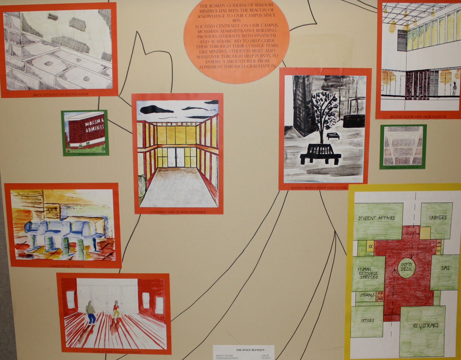
In this assignment we were to record moments within our assigned building. The thumbnails should walk viewers through your space, aiding in their understanding of its design and layout.
I explored my space from a variety of vantage points as you can see above.
-----
Above my Mossman thumbnails you will find our "Divide and Conquer" assignment. Basically we were to choose 5 perspective images drawn in 5 different styles we admire, study how we could incorporate particular techniques to further enhance our thumbnail views.
-----
Within groups we further explored the Mossman building here on campus by diagraming. I was personally assigned to the "Landscape Diagram", trying to capture a footprint and the context neighboring the building like trees, sidewalks, streets etc. I learned a lot about control with this diagram. I found that less is more and instead of color the crap out of my diagram, it would be best to be subtle. If I could redo my diagram, I would most likely fade out the picture and use more neutral tones (however these were the colors my group decided on). Other then the fact that it looks like a 5 year old did it, I think it well expresses the surroundings of Mossman and if you were to suddonly step onto the grounds around the building you might just know where you are and what is around you.
-----
Finally, in our building groups we made presentation boards consisting of two large diagrams of our choice, 3 perspective drawings from each group member and one thumbnail from each person as well. We based our color scheme around the color palette we chose for our diagrams, red, yellow, orange and green. We always brainstormed ways to express the basic function of the Mossman building itself, to guide and lead college students in all their academic and financial needs. We related this to Minerva, one of UNCG's founding inspirations, the Roman goddess of wisdom and knowledge. Our composition layout of the board was intended to mimic the layout of Mossman, placing the diagrams as the cubes of the building which were largest and so on.

Wednesday, February 17, 2010

ohhhh how i love my slr :)


Vertical Moments of Light--2-17-10 Environmental Design 102


In the window space provided for us, we were to create 2 moments of light defined space with the material provided (Cardboard) and no more than 2 other materials of our choice. The composition should be no deeper than the window frame and must consider the entire space of the window. We were to create a system that uses only friction, no adhesives or mechanical fasteners to keep composition in place.

My desk window is side by side to three others forming a perfect square. Abigail, Kacie, Jenni and I naturally teamed up together after part of the project's objective was to relate to the surrounding windows in our space. We were inspired initially from the top photo on this post. We were entriqued by the rectangular and square patterns as well as the individual patterns within those shapes. We took on the task of replicating these geometric shapes right away. Our first full scale was composed of three sided boxes, taped and put together to entirely fill each window. The craft was not quite up to par and we didn't care for the open spaces you could see from the side angles viewing the windows.

Our second and final window models were completely reconstructed out of 5 sided boxes, suraded at the fold and hot glued on the edges to assemble them. This method was much more affective in showing our two moments of light, those being the negative space randomly placed between shapes and the shadow those spaces have on the surrounding boxes. Another light affect that was later discovered is how the artificial lighting on the inside of Gatewood plays on the geometric extrusions and the golden light that shines through the grained edges of the boxes.

Create a Ritual--2-1-10 Environmental Design


Our assignment was to use an object of our choice, write a ritual and create two more accessories to go with your object. Your objects and their relationships should be part of the creation and performance of the ritual. Your objects should not be 'illustrations' of the ritual.


To me, a lot of ritual meaning lies within words, these words help support my faith and positivity in life. One way in which I receive this “refreshment” is in the writings and doodles from my boyfriend Erik. They are a huge source of comfort to me. Anticipating these letters is one of the most enjoyable things to me, opening my mailbox and reading through his goofy or serious poems is one of my favorite rituals. Even more importantly, it is critical to me to keep my letters safe and protected, to always look back on as well as remind me of the care and talent for others I always aspire to have.


Project Analysis and Process
My Ritual experience objects are comprised of wood and my chosen second material, paper. I began my design ideas by thinking and sketching out multiple thumbnails of some of my most used and most sentimental personal belongings. My letter’s spoke to me more than just any simplistic ritual such as a daily ritual for any common person. I am certain I am the only student who chose their boyfriend’s letters, that is always my goal to do something close to my heart and different than anyone else.
Thinking about what could “accessorize” my letters was somewhat difficult for me, I did not want to create anything too literal. However, in the process of receiving letters how I do, a mailbox is a large part of my ritual. Therefore, it seemed fitting to start brainstorming the approach of making a personalized mailbox.
My final mailbox is made solely of birch wood, and one hinge. It is shaped identically to my mailbox here at school for obvious reasons. I chose to paint it black, as well as attaching a small square piece of extra wood to the front door to act as a handle. A simple 10x5 rectangular storage box was the outcome. I can set it on my desk or shelf for safe-keeping.
In my second constructed object I wanted to emphasize the feeling of emotion and personality more than support and modernism. I found a beautiful, thick green and black paper that reminded me of Erik. Once I found this “special” paper, it inspired me to make a personalize envelope for later viewings of my letter. The paper and letters are folded in threes and safely kept neat and flat by a rectangular 8 ½ x 3 1/2 wood plate. The letters are bound to the board and decoratively held together by silver ribbon woven through small holes in the wood and papers. It is knotted together to secure their position and it consists of knotted loops to enclose the entire ensemble on the outside of the envelope. This envelope is meant to rest inside my mailbox shelf as part of the ritual I am trying to portray.
In conclusion, looking back on my Ritual objects as a whole, I may have done a few things differently. I might have experimented a bit with easier ways to close the envelope as well as maybe a more edgy looking mailbox design. However, I am very satisfied with the outcome of my project. I believe it deserves at least a B. It is constructed with much care and very neat to look at. My object relate in my opinion just as was stated they should when the project was first introduced. Although the ideas for my ritual object came quite quickly I do not necessarily mean I didn’t put enough work into it. I think it shows that I was inspired and knew exactly how to express what message I was trying to get across to the viewers. I estimate that I put approximately 60+ hours into this particular project, which I think it appropriate considering that my second material was not a very time consuming one. This estimation includes brainstorming, material shopping, sketching, discussing with fellow students, time in the woodshop and studio after hours drawing and crafting my design.