Wednesday, January 27, 2010

First Week Back--Design Visualization 112--1-26-10


Below is the magazine layout I chose from Teen Vogue this past fall.  I made it my own by drawing about my first week back to school, saying goodbye to Minnesota and hello again to North Carolina.

Wearable Watercolor--1-28-10

I'm extremely proud of how my first watercolor came out!  I chose to make the right have look intentional with the face of Abigail being right above Jacklyn's shirt...I was going to continue on the left side with an arm but no one had accessories I wanted to draw. I chose Kacie's necklace..the color palette draws all the accessories together very well I think.

Monday, January 25, 2010

Illuminated Objects- Design Visualization-01-21-10


For this small assignment we each chose 5 artifacts from studio or home that have importance to us. We were allowed one color and only black pens. In my composition I picked my dance sculpture, bible verses, my ring, "Dance with Me" sign, and music in general to show my love for expression and faith.

Layout: Layout is very important in any ensemble. It automatically makes whatever it may be, visually pleasing to anyone even if you don't like what someone is portraying with their layout. Choosing similar color, text, and content is all including in the overall layout and without fluidity, your work will be a mess to the eye.

Color: Choosing color can change the mood of your presentation very easily. First picking what feeling you are trying to put across and then pick colors that help you feel that way. For example if you pick dark, deep colors ...people are more likely to think it looks stiff and serious. However, choosing brights would add interest and contrast as well as a happy mood!

Text: BIG, bold letters will definitely grab the attention of the onlooking, however is that what you want to stand out in your presentation? Maybe not. The size, style, and color of your text is critical to showing either the key points or hiding the words and letting other parts of the presentation stand out as the focus.

Hierarchy: The way in which you arrange the different parts or pieces to your project may make or break the over successfulness. Try not to make the eye dart from space to space, but instead flow from picture to picture, drawing to drawing etc. It will make the reader want to read or look at more and it'll help avoid a headache.

Thursday, November 19, 2009

Luminescence Expressive Drawing 11-20-09 -Environmental Design 101


...Some brainstorming ideas for my "Expressive" drawing of my Luminary, the next step. With certain guidlines to follow such as paper type/color, drawing utensils (3 colors only) and size...it was time to get creative with a composition that compliments my Luminary. I chose Indigo Blue Canson paper and purple, yellow and orange pastels that nicely resembles the light, shadow and shapes of my field of light and lighting structure itself.

Wednesday, November 18, 2009

Luminescence Final Model- Environmental Design 102


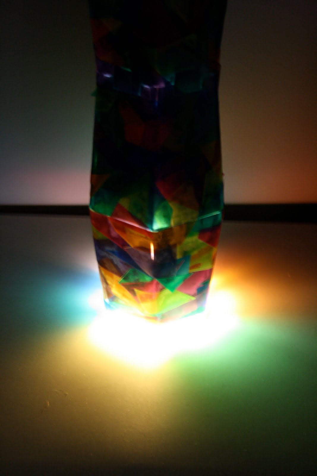
...This is my second and final "Luminescence" model. I made quite a few adjustments to my construction this time. I chose to Double the size of the lamp so the light bulb itself could sit high enough above the colored cut outs to give off a definite pattern of shapes on the surface it is hung. Also I lined the inside with black construction paper to block out the light, focusing almost all of it on the light source coming out of the bottom. I covered the seems where the plastic pieces attach to make it more unified.

Overall, I love what I did and I am very proud of the product I produced. This lamp isn't intended for a specific place in a house or hovering over a certain piece of furniture. But it is meant to be displayed so the field of light is at it's finest, whether that be sitting on something or being hung, the choice is yours. However, we were to include our Luminaere in our "Lake House" designs for our IAR 110 class. I chose the young boys room, hung over the dresser. The light affect and colors of the lamp went best with his bedroom and the essence it was already portraying. Fun and young but soffisticated enough for a 12 year old boy.

Tuesday, November 17, 2009

Luminescence-Continued


This is my first ideation of my Luminaire. I was inspired by kaleidescopes. It's built mainly of plastic parts i found in two bird feeders, binder dividers, and bristol board as the cover. As it was tested numerous times, we came to the conclusion that the "field" of light it gives off isn't quite strong enough so I'm currently putting the finishing touches on a new model. I love the light that shines through the plastic however that doesn't leave a strong enough stream of light for the reflection on the surface to be noticeable enough.

Thursday, November 5, 2009

Luminescence 11-6-09

Intense Lighting

Low Light

Color


Nightlight

Sunset


Uplight


Direction

Spotlight

Lamplight


Sunrise

Midday


"Design a luminaire using two materials that you used in previous projects, plus one new material of your choosing. Your luminaire should create a field of light that articulates the surface upon which it is cast. The light source is to be a compact fluorescent bulb(wattage of your choice) in a standard electric bulb socket."

I am finding this project difficult to be honest. The limits are endless and the guidelines are so vague that my mind goes everywhere when brainstorming for this particular project. Also I'm not familiar working with lights and electricity so this should be interesting! My main inspiration right now for "Luminescence" is a kaleidoscope. The multi-colored glass and the affect is has on whatever it is shining. We were asked to research different forms of lighting, natural and unnatural such as a sunrise, sunset, spotlight, nightlight, shadow, contrast, color, starlight etc. As I explored different photographs, some I have taken and others not...I have looked for a lot of different colors and glow in the field of light which I think resembles a kaleidoscope very well.